
Every transformation has a story, and today, we’re excited to share ours. At Refrens, we’re unveiling more than just a new logo – we’re revealing the next chapter in our journey to revolutionize how businesses operate.
The “Why”: Evolution That Called for A Change
Refrens began with a simple yet powerful idea: creating a referral network where businesses could help each other grow. (Yes, that’s where our name “Refrens” came from!)
We started as a B2B services marketplace, equipped with essential tools like quotation and invoice generators. But here’s where things got interesting – these tools didn’t just catch the eye of B2B service providers. Like a magnet, they started attracting all sorts of businesses: D2C brands, manufacturers, wholesalers, exporters, and MSMEs. Everyone found something to love in our simple, functional offerings.
Through countless conversations with our users, we stumbled upon a universal truth: businesses were fed up with complicated, hard-to-use software that seemed designed to confuse rather than help. They were crying out for something more intuitive, something that just worked. That’s when we knew it was time to pivot.
Fast forward to today, and Refrens has evolved into something much bigger – a comprehensive business operating system that takes the headache out of everything from invoicing and accounting to sales, compliance, business intelligence, payments, and inventory.

The “When”: When We Outgrew Our Origin Story
As our platform evolved and our user base grew more diverse, our brand identity needed a refresh.
Our original logo, bless its heart, had a few… let’s call them quirks:
- People often misinterpreted it as a backward-pointing arrow (not the best symbol for a forward-thinking company), a rocket, or even a media player button
- The ‘R’ looked like it had one too many drinks – wonky and a bit off-balance (Was intentionally fun for our earlier brand persona, but not ideal for where we are heading)
- The flat look was lacking the visual punch needed for a serious business platform
- The whole thing felt more like a casual Friday than a professional Monday
- It didn’t reflect our vision for an AI-native ecosystem
- While it served us well in our startup days (like those first apartments we all had), we’d outgrown it. Our platform had matured into a sophisticated business operating system, but our logo was still wearing shorts to board meetings
These realizations sparked an important question: if our current identity didn’t reflect who we had become, who exactly had we become?
We knew we couldn’t move forward without first looking inward. It was time for some self-reflection.
The “How”: Redefining Our Brand Identity
1. Deep Dive: Understanding Who We Really Are
We knew we needed more than just a fresh coat of paint – we needed a complete reimagining of our brand identity. So we did something that might sound a bit old-school: we got our team together, grabbed some coffee, and started asking the big questions. Not just “what should it look like?” but “who are we really?” and “where are we heading?”
For this, we created a questionnaire that different team leads across departments had to fill out. The questionnaire revealed fascinating insights about who we were and where we wanted to go. But to truly build a lasting identity, we needed to dig deeper – we needed to uncover the fundamental values that would guide us through our next phase of growth.
(Need the questionnaire? Just comment below, and we will DM you!)
2. Building Blocks: The Values That Shape Us
Armed with Jennifer Bourn’s guide (our brand values bible), we embarked on what felt like a some version of speed dating – starting with 150 potential brand values and trying to find “the ones.” Through careful consideration and some heated debates (you should have seen our Slack channels!), we narrowed it down to 30 values that felt like us.
But even that wasn’t enough. Through affinity mapping (fancy talk for grouping similar ideas together), we finally landed on our core five: Growth, Innovation, Trust, Simplicity, and User Empathy. Think of them as our brand’s DNA – the essential building blocks that make us who we are.
With our values clearly defined, we now had a strong foundation to build upon. But how do you translate abstract values like Growth, Innovation, Trust, Simplicity, and User Empathy into visual elements? We knew we needed to learn from the best.

3. Drawing Inspiration
When it comes to creating a new logo, you can’t just jump in blindfolded. We needed inspiration, and lots of it. Think of it like creating a mood board for your dream home – you want to understand what works, what doesn’t, and why certain designs stand the test of time.
We dove deep into analyzing successful brands across industries. From Tesla’s cutting-edge innovation to Apple’s minimalist sophistication, from LinkedIn’s professional trust to Canva’s accessible creativity. Each logo told a story, and we wanted to understand what made these stories so compelling.

Armed with insights from successful brands and a clear understanding of our values, we were ready to begin the most exciting part of our journey – creating an identity that would truly represent the new Refrens. But where do you start when you’re designing the face of a company’s future?
4. Crafting Our New Identity
4.1) The Foundation: Choosing The Shape
Here’s where things got really interesting. We stood at a crossroads between two paths: should we go with flowing, organic curves, or embrace solid, geometric shapes? That’s when Naman Sarawagi grabbed a marker and posed a question that would answer this:
The answer was crystal clear – we needed something solid. After all, when businesses are choosing software to run their operations, they’re not looking for something fluid and uncertain. They want stability. They want reliability. They want something as solid as their ambitions.
With the decision to go solid, our next challenge was finding the perfect shape that would embody everything we stood for. It needed to be timeless, meaningful, and instantly recognizable – like finding the perfect foundation for a house that would stand for generations.
4.2) The Symbol: Power of the Pyramid
With our direction set, we rolled up our sleeves and started exploring solid shapes. Hexagons, triangles, squares – you name it, we tried it. Out of hundreds of variations, we managed to narrow it down to 11 promising candidates.
Then came the fun part – the rejection process. And trust us, it was quite the journey!
Logos 3 and 8 got the boot after we stumbled upon a hilarious tweet comparing certain AI company logos to…
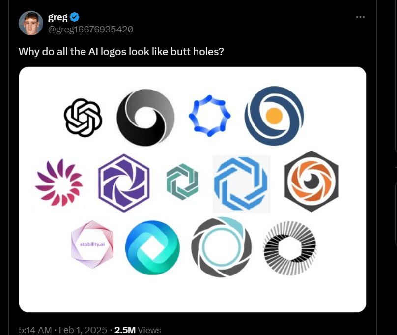
Well, let’s just say it wasn’t the association we were going for! (Once you see it, you can’t unsee it!)
Logos 6 and 9 felt more at home in an esports arena than in a business software platform. Logo 10 seemed like it had missed a few pieces, while Logo 2 reminded us of a faceless, limbless doll – not exactly the professional image we were after!
What really caught our eye were numbers 5 and 7. Why? Because there’s nothing more solid than a pyramid. These ancient wonders have stood the test of time for thousands of years – exactly the kind of stability a business owner wants from their operating system.
The pyramid became our symbol of:
- Strength and Achievement: Like those ancient marvels that have weathered millennia
- Growth and Transformation: That upward-pointing shape that says “sky’s the limit”
- Stability and Reliability: A broad, unshakeable base to build upon
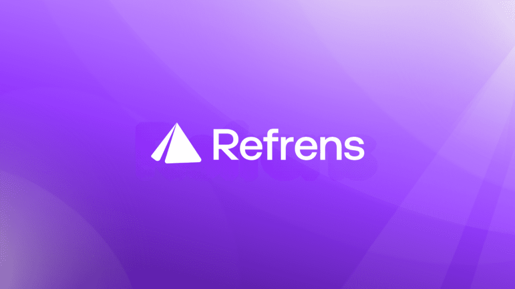
We ultimately chose design number 5, with its distinctive slit cutting through the pyramid. This wasn’t just about aesthetics – this slit symbolizes the energy and acceleration we bring to business operations, the momentum to break through limitations, and the upward trajectory we help businesses achieve. Plus, as we move toward an AI-native ecosystem, this slit opens up exciting possibilities for dynamic animations.
4.3) The Voice: Our Typography
Think of typography as the accent of your brand – it’s not just what you say, but how you say it.
Our custom typeface isn’t just about looking pretty – it’s a careful balance of form and function. We went for a bold, geometric foundation with sturdy verticals and open curves, conveying stability and precision.
Letters like ‘R’ and ‘f’ got sharp, distinctive exits – think of them as well-dressed professionals making a confident entrance – while letters like ‘e’ and ‘n’ kept generous apertures, symbolizing openness and transparency.
4.4) The Color: Evolution of Purple
Sometimes, the best path forward is to build on what works. Purple has been our signature color from day one, helping us build strong brand recognition with hundreds of thousands of users globally.
So instead of a complete color overhaul, we evolved our purple with an electric gradient that speaks to innovation while maintaining that familiar Refrens feel – like giving your favorite suit a modern twist.
4.5) The Complete Picture: Bringing It All Together
For the design nerds out there (we see you!), you probably know there are eight different types of logos: lettermarks, wordmarks, abstract marks, pictorial marks, letterforms, combination marks, mascots, and emblems.
For B2B SaaS companies like us, combination marks are the way to go – they give you the flexibility to use either icons or text or both, depending on where and how you’re using them.

The “What”: What This Means for Our Users
This transformation marks the beginning of an exciting new chapter in our journey. Over the next five years, our vision is clear: to become the world’s leading AI-first business operating system, bringing efficiency and ease to millions of businesses globally.
But while we’re evolving, some things won’t change. Our commitment to simplicity, our obsession with user experience, and our drive to make business operations easier – these values remain at the heart of everything we do. The new Refrens is structured yet dynamic, sharp yet approachable, strong yet effortless.
We’re not just changing how we look; we’re revolutionizing how businesses operate. And we’re just getting started. Join us as we write the next chapter in business operations – one where complexity gives way to simplicity, where frustration turns into delight, and where every business, regardless of size, has the tools to thrive in the digital age.
Related Posts:
 Your Complete Guide to GSTR 3B: Filing Process, Due Dates, Penalties, and FAQs
 A Complete Guide to the Types of Invoices
 How to Create a Strong Small Business Brand on a Budget?
 E-Invoicing Around the World: A Global Overview
 Creating A Stellar Business Profile: A Step-by-step Guide
 Crafting Digital Narratives: Spotlight on Refrens’ Marketers and Creators
 Spotlight on Global Graphic Design Talent: Refrens Features
 How To Create An Invoice?
 Discovering Diverse Talents: A Glimpse into Refrens Features
 Spotlight on Global IT and Web Development Innovators: Refrens Features
 Top 10 Billing Software for Law Firms
 How To Become A Copywriter – Beginner’s Guide
 Export Invoice: A Complete Guide for Seamless Trade